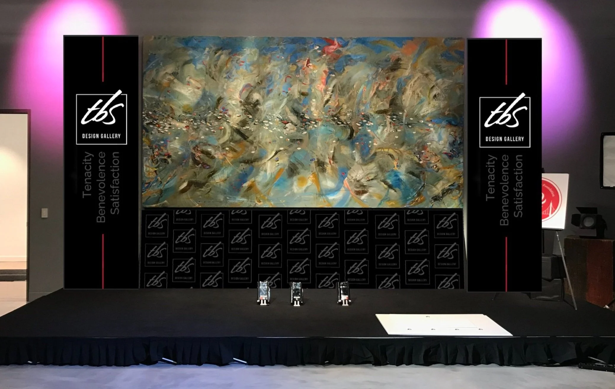
Design Gallery Banners
TBS Design Gallery, Santa Clara
O C T - D E C 2 0 2 2
Tenacity, Benevolence, Satisfaction.
The TBS Design Gallery is a family-owned, Bay Area Home Design Studio with expertise in luxury interior and exterior design. They are partnered with and represent many high-end vendors and are very hands on with their clients. In my time there, there I had admired how they were very in-tune with aesthetic value and how to go above and beyond in hosting corporate networking events and their style of communicating with clientele. You can find their website here: Bay Area Home Design Studio | TBS Design Gallery
The purpose of this project was to elevate the gallery space. There were spaces around the canvas that didn't live up to the standards of the community. Prior to the project, there would be small stands or a simple black cloth draped at the bottom of the canvas.
By creating this project, the company would be able to have a more put-together, seamless background for panel discussions, and cinematography, as well as add to the gallery atmosphere as a luxury brand.
dROP-DOWN thumbnails
These were the earliest drafts of the flags. I had used the brand’s guidelines, which were white, black, grey and red. I played a bit with the design of the flag, adding some kind of movement with line and shape, and asked the opinion of other employees in the gallery for each draft. Eventually I settled on a higher contrast, bolder look, similarly to the first draft design of the bottom banners.
BOTTOM BANNER thumbnails
For the bottom banners I wanted to try to add more textual information, such as using type to write out the mission statement of the company. The most difficult thing was making the upcoming design compatible with the drop-down flags, and not visually overload the viewer with elements. The design had to be very minimalistic as a result.
2ND revision
FINALIZED DESIGNS
Left: The final version of the drop-down flag. Small revisions were made for this one— the logo is sized smaller and the spacing is roughly equivalent to the width of the logo. The red line was to add color, as well as add motion and to compliment the length of the flag.
Above: This design was modeled more like a step-and-repeat backdrop. After talking with the company, it was decided that we were going to go on a very subtle, very simple pattern. Keep in mind that the purpose of the banners was to serve as a backdrop for media and press coverage.
The one thing that I would keep in mind for future projects similarly to this one is the general purpose, keeping strictly to practical purpose of the product(s).


