get wells soon logo revamp
Graphic Designer @ Get Wells Soon in San Francisco, California
D E C 2 0 1 4 - J A N 2 0 1 5
this non-profit organization was created by some friends in middle school. We worked with philanthropists, and participated in charity events to help raise funds for clean water in impoverished countries, starting with Burma.
You can still find Get Wells Soon on Facebook, but it has since been discontinued in terms of charity events.
-
From This...
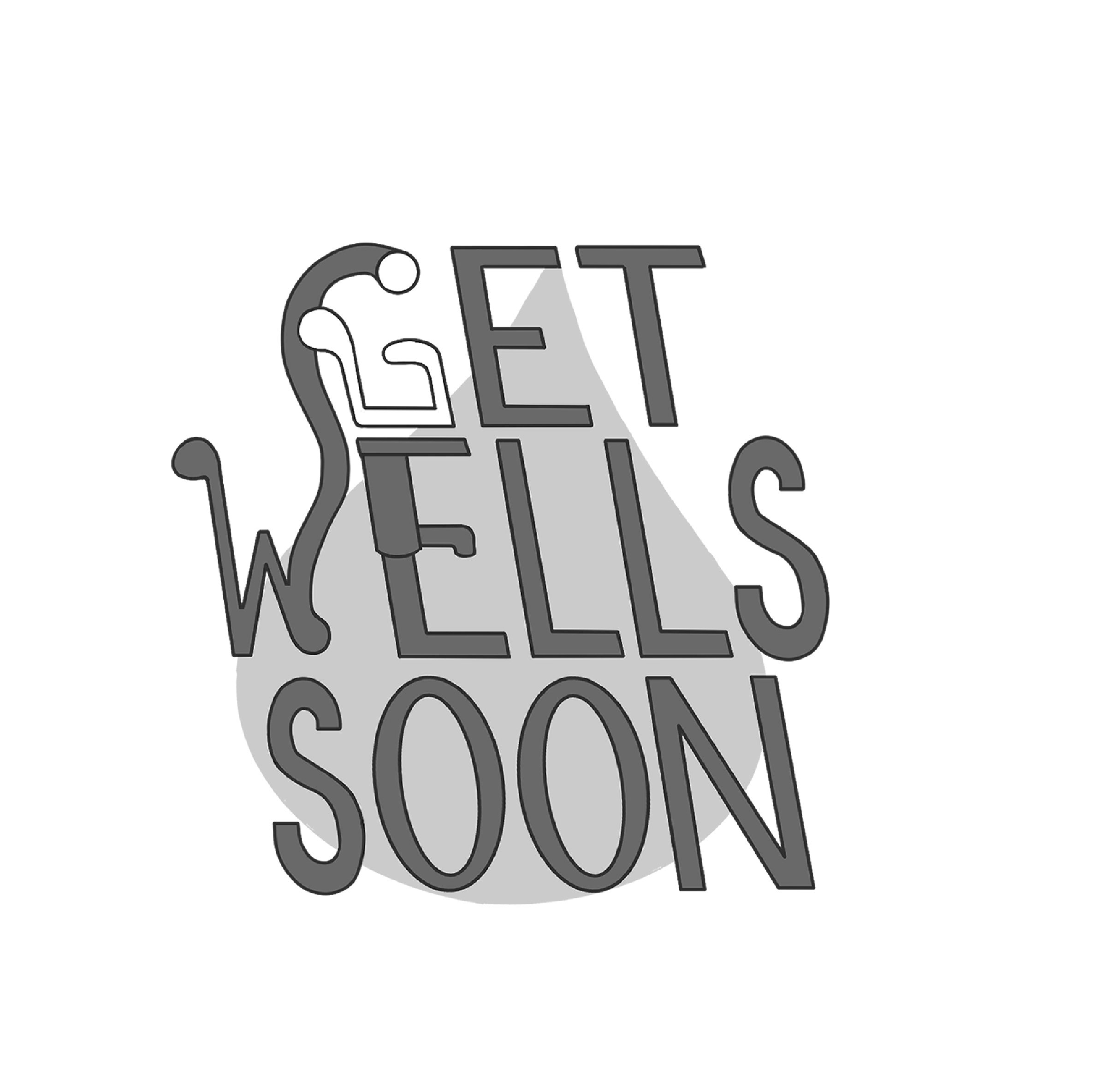
The original design was created with my trusty old program, PaintToolSAI. Since our mission was to give clean water to impoverished countries, which would start in Burma and ideally spread globally, the idea was to take a literal approach.

-
To This.
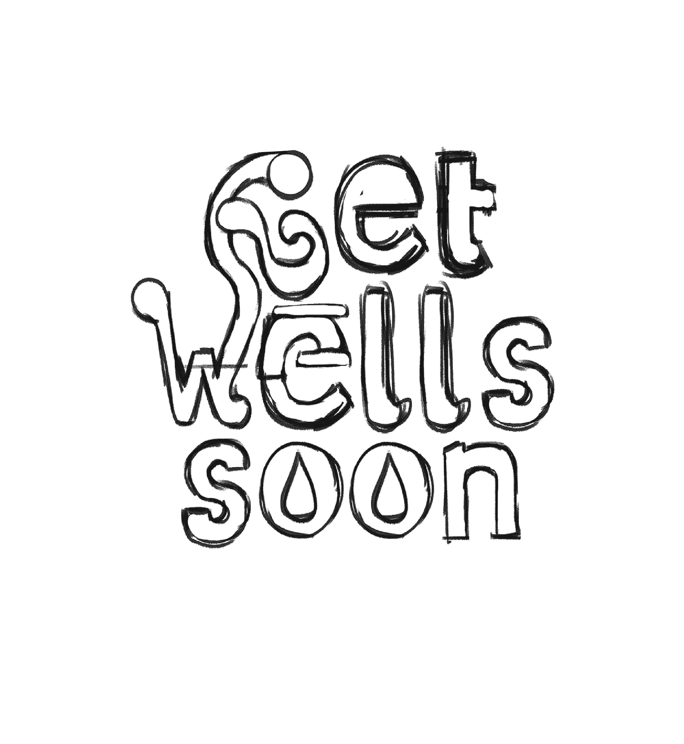
After years of practicing in design, I’ve learned that the two most important things to consider when viewing a logo for the first time is “can it be read?” and “can it be easily recognizable?” The font chosen was Nunito, which had rounded edges that would work for a fresh modern look. I adjusted the kerning to make the text look “airier” and “refreshing” and add to a more open looking composition.

new logo brainstorming...
How can changing one letter of the font create subliminal messaging to the brand? How can certain forms or shapes visually convey what the organization does? I experimented a lot with the idea of transforming the “G” into a related object to the company, as the original logo had a water pump on it, but later opted for something less literal, focusing on the main idea of the group, which was to provide fresh water to areas who can’t have it.


bW + colored versions
The color in the new version looks refreshing and simple to read, all the while visually representative of clean water in a literal sense without the design feeling overdone (i.e., drawing the silhouette of a water pump with water coming out).
