SLEEPY CORAL SERIES
DES 135A class at UC Davis, California
W I N T E R 2 0 2 1
interactive furniture design
Can the furniture transform or fold into something else? Can it play music? Can it change colors by heat? Is it a form of modular design and be put together like a puzzle? This was the main theme of the project. Interactive furniture design can be both functional for relaxation, but also have hidden features that allow humans to play with the design. Interactive furniture design can have anything to do with people interacting directly with the furniture or to let the furniture allow people to interact with others. I explored the latter of this statement. When COVID begins to subside, how can furniture and architecture help reintroduce sociability when society returns to “normal”? Depending on your personality, you might act differently from your friend, or your neighbor when COVID restrictions come to an end. The Sleepy Coral Series itself is thought provoking to how introversion and extroversion is projected as furniture.
-
Interactive design to me can also include how people react with each other when using the Sleepy Coral Series. It does feel more like a social experiment, but I feel that is part of the design’s experience. As a nod to the more literal definition of interactive furniture design, the way each part of the series is shaped doesn’t give a direct implication of how one should sit or lay in it. Everyone interacts with furniture differently. For example, the figures I drew in the poster design probably would sit differently from other people who’d use the series, and that itself is interesting about my furniture design.
-
By association, coral makes me feel calm because the ocean is associated with it. You could say, it gives an easygoing vibe because it goes with the flow. Aside from that, I was working on a photography project and stumbled across some old organic forms I created in an older class that symbolized coral. I enjoyed that sculptural class so much I decided to use similar forms.
-
I think the general public would be my main audience. The kind of environment would be a public space, but near an arts or theater district just so people would be in the right mind space to think about what the Sleepy Coral Series is about conceptually. Groups of people, whether they know each other of not, would be my target audience.
concept and technical sketches
Fun Fact: In the files not uploaded, I went through about three more pages filled to the brim with random organic and modular forms.
-
CONCEPTUAL DESIGN
When brainstorming, I thought about two different concepts: a more organic design and a more modular, geometric (in the form of circles) design. The forms with the stars next to them were the chosen ones into the next part of the brainstorming process, which in sizing the furniture pieces.

-
SLEEPY CORAL VS. SEMI CIRCLE PART i
More exploration of what the Sleepy Coral Series might look like versus the Semi Circle Series, and the estimated measurements of the pieces.

-
SLEEPY CORAL VS. SEMI CIRCLE PART ii
Further exploring the idea of what was possible for each series concept. Both would have options for solo and group use. When deciding on the series I contemplated which would be more aesthetically interesting, and also thought about the use of materials for the pieces, and settled on the Sleepy Coral Series.

-
SLEEPY CORAL'S FINAL DESIGNS
The organic shapes were what I was looking for in the project, and all I needed were stronger, more developed forms. I went back to the drawing board and came up with three new forms for the series, later which would become the final design and go into the final contextual sketches.

When COVID begins to subside, how can architecture help reintroduce sociability when society returns to “normal”?
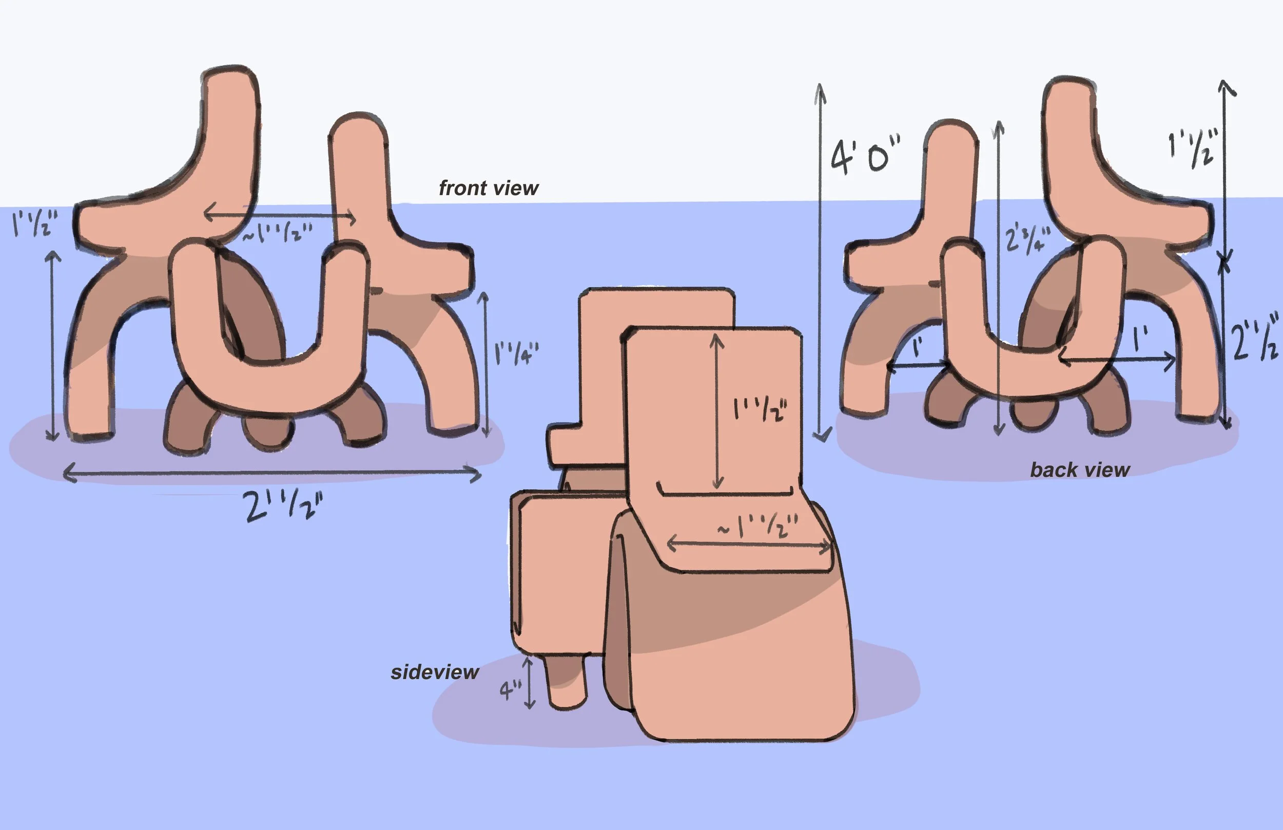
TECHNICAL DRAWINGS
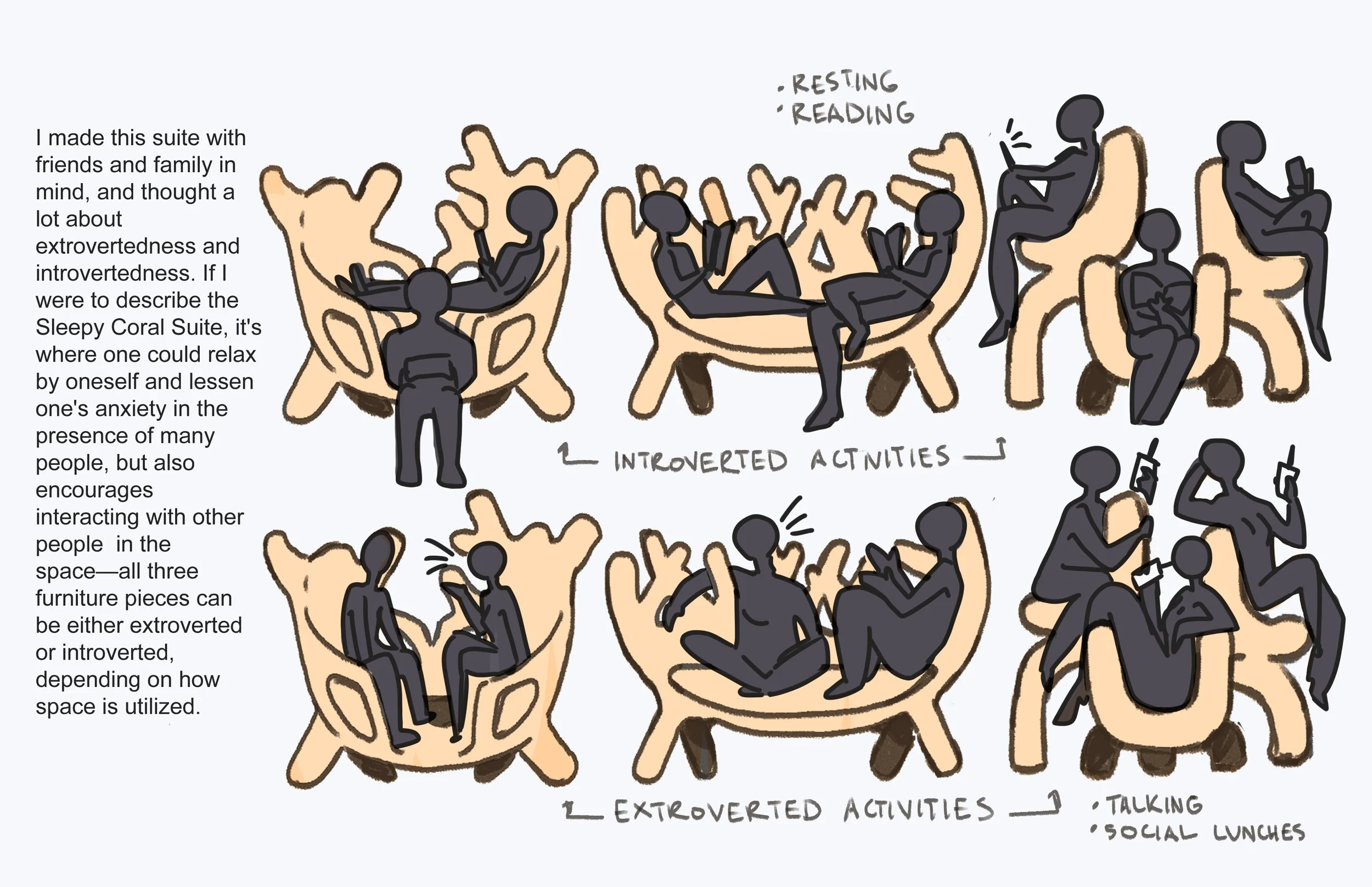
The Sleepy Coral Series is dependent on the interaction of people towards each other, and each part of the series is a representation of sociability among certain groups or individuals.
-

THE AMBIVERT
The ambivert of the series has two seats. Whether or not it’s inviting for one more or just made for one person to stretch their legs across is up to interpretation. The design of the chair allows for one or more to enjoy a conversation privately with a small lunch or drink.
-

THE INTROVERT
The way the introvert of the series is created looks like one large couch. One person laying down can be in it, or a few people depending on how comfortable they are with each other, which is how an introverted person usually feels. The backing or surrounding part of the seat cradles the users, comforting them from outside stimulus.
-

THE EXTROVERT
Having one person sitting would also make this part of the series feel incomplete, hence why this is called the “extrovert” of the sleepy coral series. The seating doesn’t feel closed off from the outside world and is most inviting for the general public.
“…each part of the series is a representation of sociability among certain groups or individuals.”
ANATOMY OF PARTS
The professor said we had to create life-size 3D models of our furniture pieces. What I had in mind for the construction of the work was to glue cardboard on top of each other by constructing each glued panel horizontally and working from the bottom up, similar to this vintage corrugated board. Although this idea would always be what the furniture should and would look like if the deadlines were so tight, I opted for a grid system to at least show how it would structurally be.
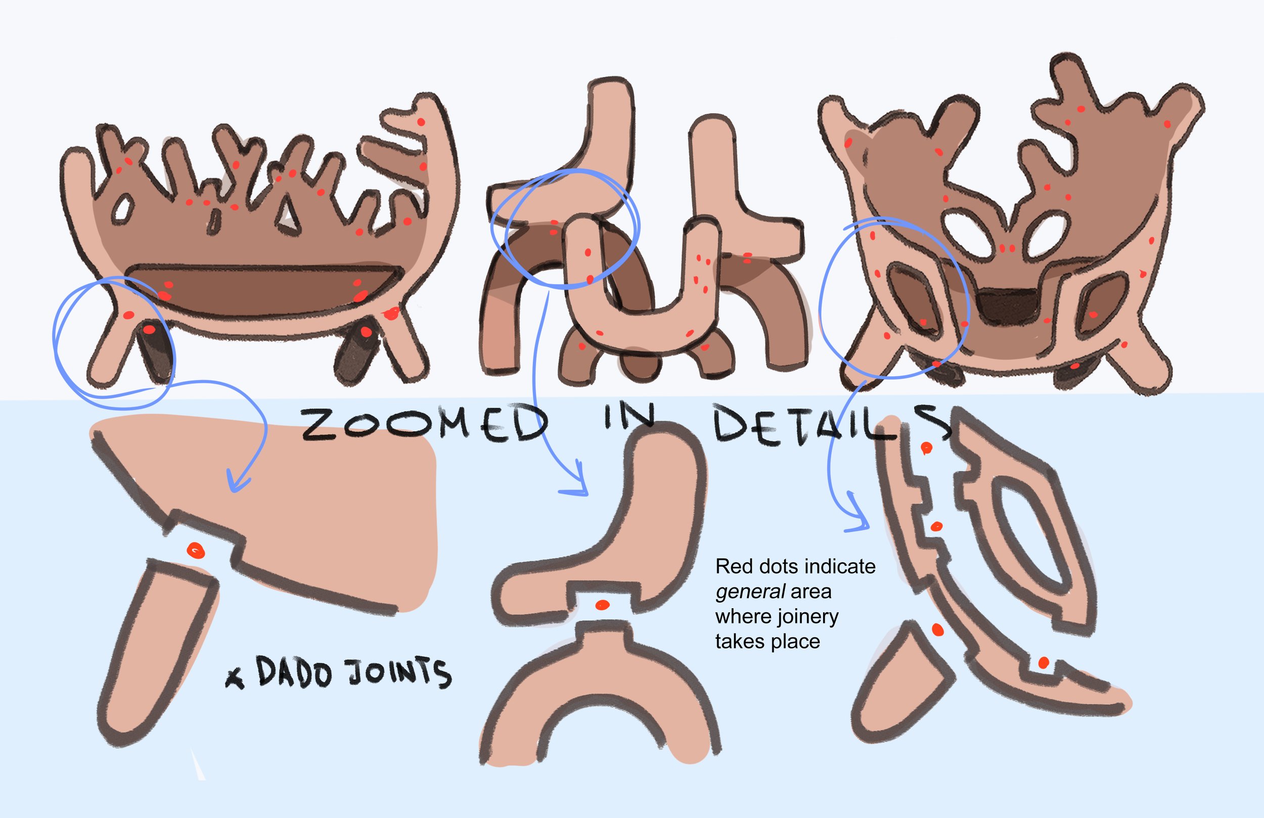
DETAIL CONNECTION DRAWINGS
With the idea of the corrugated board furniture, detail connection drawings featuring dado joints into its assembly would be done to make production easier.
study models
-

Clay Model pros
Homemade clay is easy to make in any kitchen, and does a great job of allowing you to cut out cross-sections to explore the anatomy of parts.
-

Clay Model Cons
The density and high malleability of this material makes the model sag and droop. I had to use napkins to portray a fair miniature 3D model of one of the series pieces, so next time I would stay away from using homemade clay for geometric designs.
Cardboard scale model
-

model parts for large chairs
The reason why the extroverted chair was chosen as the study model was because it had the most minimalistic design and could be most represented as modular parts: the two large seats and the smaller U-shaped seat. The inner parts of the seating gird would have joinery parts because it was difficult to find adequate cardboard sizing.
-

model parts for small chair
Exactly how the large cardboard seating was made, the small U-shaped chair also would be cut into smaller pieces, adding for more assembly but less work on finding large enough cardboard pieces.
-

joinery pieces
The assembly of the entire project took about 6.5 hours to make. The final product was a good showcase of how the 3D model would be as a full form and how it would work structurally.
-

Final thoughts
The amount of cardboard used and the way the assembly was made the final product a bit flimsy and not capable of holding the full weight of a person. I think if I had more resources and more time on this project, I would go for a full volume, corrugated cardboard structure that was glued panels of material rather than a hollowed grid system.


